

The other day I read an article written by Greg Gifford, board member of our DFWSEM group, called 10 Common Mistakes to Avoid on Local Websites and this made me think. First I thought, great article Greg, then I thought…wait, that’s not all of them! One of the most important things today is audience engagement right? So I think you will agree, it’s important NOT to annoy your audience.
Your website serves as the hub for all of your online activities, but if it is not user friendly, it will most likely be turning people away more than getting them to stay. Web users have a short attention span, so if your website and its content don’t grab their attention in the first few seconds, they’ll likely leave for good. So here is my addition to Greg’s article!
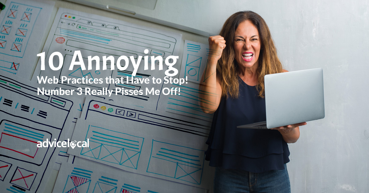
10 Web Practices that Have to Stop
1 – Loading Screens
We all know that website performance is important. Most visitors, me included, will leave your site, never to return if your homepage takes more than a few seconds to load. Worse still, is if your visitors are confronted with a loading screen, we are out of there! While they were quite common in the earlier days of the Internet when loading screens often accompanied websites programmed in Flash, but they have absolutely no place on the modern web.
2 – Unintuitive Icons
If you’re going to use an icon-based navigational system, it is imperative that each icon displays a clear indication as to its function. In fact, my suggestion is it’s best to avoid using icons entirely, except for those that are very widely recognized. Instead, stick to using common navigational layouts so that your visitors always know what to do next when they arrive on your website.
3 – Autoplay Media
Ok people, you need to stop this immediately! Having video or audio content play automatically when someone visits your website is just downright intrusive. Not everyone wants their silent browsing experience to be suddenly and rudely interrupted by a video or theme tune. Always let your visitors choose whether to play media content, otherwise they’ll more likely click the back button as soon as they arrive. That’s what I do.
4 – Skeuomorphism
Skeuomorphism refers to the practice of designing a user interface to emulate a real-world object. For example, a blog may be designed to look like a diary, but this web design technique now looks dated. Instead make way for the often superior functionality of a clean, flat design. If you must make use of skeuomorphism in your design, just make sure that it doesn’t sacrifice utility.
5 – Intrusive Advertising
Many web designers don’t use on-site advertising responsibly; instead they bombard their visitors with intrusive advertisements that constantly distract them from the actual content that they want to read. The most notable offenders include ads that appear in popups or automatically open in separate tabs. While a pop-up might get you a few more subscribers, it will likely lead to a greatly increased bounce rate too.
6 – Distracting Animations
As you already know, you have only a few seconds to get your visitors’ attention, so minimizing distractions is essential. Although every web designer wants their websites to look unique, it is always best to stick to tried-and-tested design and navigation techniques without risking raising your visitors’ ire through the use of distracting animations or flashing ads and other on-page elements.
7 – Generic Stock Photographs
While any web designer knows that image content is important, one must also be wary of using stock photography to add visual flair to a website. Instead of using cheesy stock photographs of happy corporate people or clichéd customer service representatives, use real photography to showcase your real customers, your company and your employees.
8 – SEO-Driven Content
The most important thing of all about any website is the actual content, since this is what really engages your visitors and keeps them coming back for more. However, if your content is created primarily with the search engines in mind, it’s not likely to offer much in terms of value to the reader. I cannot be stress enough that you should write for human visitors and not for the search engine crawlers.
9 – Using PDF Files for Web Content
PDF files are great for things like e-books and media for printing, but they don’t have any place on a typical website. They’re difficult to navigate, and they tend to take a while to load. All web content should be in the HTML format, since PDF files do not make for very good browser-based reading. To summarize, stick to using the PDF format only for sharing documents that need to be printed.
10 – Walls of Text
Writing for the web is quite different from writing for printed media. With the lower attention spans of web users, few things are more unwelcome than huge chunks of text that make for uncomfortable reading on the screen. Instead, stick to publishing scanable, web-friendly content complete with subheadings, short paragraphs, images and lists.
Any way people, I want to thank Greg again for making me think a little bit more about what not to do. I’m sure we all have thoughts on this subject so let me ask you, what is your web pet peeve? What do you think you should NOT do with your website online….
I couldn’t agree with you more on the majority of these points! One thing I’m actually guilty of myself is the whole loading screen fiasco.
In my head it felt like the build up to something spectacular, in hindsight it was a buildup to a wordpress themed website with very little to brag about in terms of design or UX.
Still, I learned from that mistake.