

 214-310-1356
Mobile optimization is serious business. In the past, it was all about having a website that performed well on desktop and placed high in SERPs. In 2015, this started shifting so digital marketers and webmasters needed to focus on desktop for search placement and user experience on both desktop and mobile.
The primary index Google used to determine the placement of a website in the past was based on the desktop version of a website.
Google’s Mobile-First Index is Here to Stay (For Now at Least)
Google is shifting its primary index website by website so the mobile version of a website is the determining factor for the placement in SERPs in both desktop and mobile search. Since they are going website by website, not all websites are shifted to this index yet. As Google determines a website is ready, they are notifying webmasters via Google Search Console.
Last time we were here, I addressed What is Google’s Mobile-First Index and How Can a Business Prepare for It. This article covers in details tools a business owner or webmaster can use to determine if a website is ready.
An optimized responsive site should be perfectly placed for the change in indexing. In addition to fixing website errors and responsive issues, a business that wants their website to place high in the mobile-first index needs to consider adjusting some of their SEO best practices and maybe even a few design elements. Let’s get into this now.
Consider Meta Data
Meta titles and descriptions can vary as Google changes the design of their search pages. Currently, titles for mobile search should not exceed 78 characters and descriptions should be between 110 and 120 characters.
The downside to optimizing these for mobile is the desktop experience, because Google has increased how many characters are displayed for descriptions to 300. It seems on desktop that a description that is too short can be filled up with information from the respective page that is displaying in search results. Once a website is switched to the mobile-first index this could be a non-issue, but for now, it is something to keep in mind.

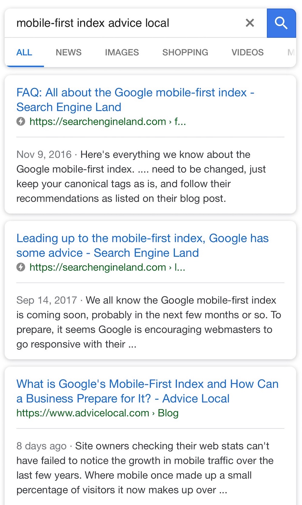
Above is an example of a desktop search displaying meta data. The first and third result are within Google’s requirements for meta descriptions, as you can see they are not truncated. We can assume the second entry doesn’t meet Google’s requirements since it is pulling content from the page for the meta description versus the meta description the author defined.
Another factor to keep in mind is Google will inject a different description into SERPs if Google doesn’t feel the one provided accurately describes a page. This is all determined by Google’s algorithms, of course.
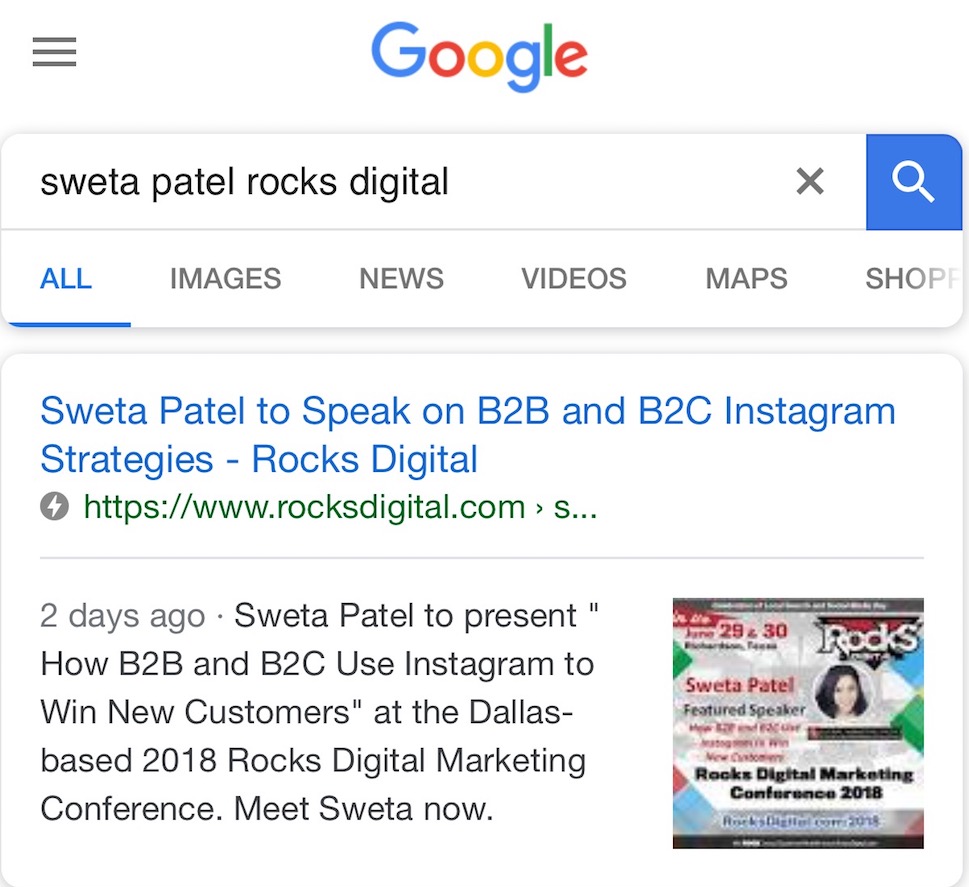
When a description is too long, it can be truncated on mobile. One way to avoid this is to AMP the website. As shown in the example above, the first and second results are AMP results. The third result is not an AMP result. You can see which are AMP results based on the lightning bolt next to the result. It seems all three of these descriptions are injected from text within the page, most likely because they are too long.
The above example shows the meta description fits mobile requirements, so the description was not truncated.
Tabs and Accordions are Making a Coming Back
In the past, information from Google recommended avoiding any methods that hid content, like tabs within pages and content that expands when a + sign or another symbol is clicked.
The limited space on mobile devices has altered their viewpoint, though, and tabs and accordions are now considered effective ways of providing user-friendly content on mobile.
A brief explanation of tab content: this is content that is displayed on a single page, but only available to be displayed when the tab is clicked upon. Think of a sub-navigation within a single page, except the content is all on a single page vs. multiple pages.
Structured Data is Always a Must
No matter which index Google is using to determine placement in search results, structured data markup is helpful for accurate indexing.
Local businesses can include structured data to indicate their NAP, business category, opening hours, and many other factors. It is important to check that any structured data included on a desktop site is also included on mobile.
You can access the guide for Google Developers to read all about structured data.
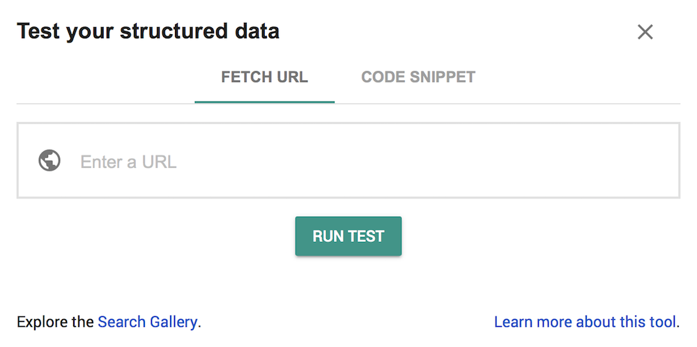
They also have a Structured Data Testing Tool that can be used to view the markup for a particular page on the web.
Audit those Design Elements
You know all those pretty elements the business added to the website way back when because it was cool, they can cause some serious problems on mobile.
What immediately comes to mind for me is the Rocks Digital website, which I’m co-founder of. There was a carousel on the homepage that made it so site visitors could scroll across and easily access the six most recent articles published. On desktop this was great, but on mobile, the only thing visible was the most recent blog published. There were no indicators to let the site visitor know they could scroll across. It was an extremely bad user experience on mobile. This feature is no longer on the website for desktop or mobile, but when it was it was removed from the mobile display of the homepage.
Design elements are integral of the user experience. Elements that don’t work properly on mobile or don’t look right are just bad for the user and will impact click-through, bounce and time on the site.
Checking the website on various mobile devices can ensure that buttons can be easily tapped, images are resized for any view, menus are not too intrusive, and navigation features are clear.
I also highly recommend the website has click-to-call, click-to-email and click-for-directions integrated. This greatly improves the user experience and, frankly, safety for those who are visiting a website for the address to get directions while driving.

Above is an example from a landing page we did for click-to-call. The site visitor could simply click the phone number and it would dial Advice Local. There is some coding behind the scenes that was applied, but it is a simple snippet of code that was identified and can be added easily.
Create Content for Voice Search
Voice search is growing in popularity, with mobile devices playing a key part in the growth. As revealed in KPCB’s 2017 Internet Trends Report, 20% of mobile queries are made via voice. Keep in mind that this was in 2017. I’m sure this number is even higher today.
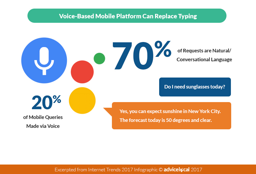
Not only are more mobile users turning to voice search, but they are searching using natural language. No longer are they saying “Wine Bar, Dallas,” but they are asking questions like “Where is the closest wine bar?” and some even more specific like “Which wine bar serves Merlot?”
To improve SEO for any given piece of content, it is important to consider what a voice searcher might be looking for. Typically, answering questions is a great way to cater to voice searchers, with the added bonus of possibly being included in a featured snippet.
Don’t Let the Mobile-Index Bury a Website in SERPs
While the mobile-first index may be a challenge for some businesses, others will find it a relatively straightforward process with many opportunities. Some websites, particularly in local markets, aren’t prepared for the switch, so this is a great opportunity to improve rankings and gain more website traffic.
Businesses currently catering to mobile visitors and included in the new index could already be receiving more frequent visits from the mobile Google crawler than those that are not. Ultimately, delivering the best possible experience for all users should be the forefront of design and SEO. Taking the opportunity to deliver exceptional service will only increase mobile conversions and improve the bottom line.
Once the businesses you represent have a mobile-first, mobile-focused website, they are well on their way to generating mobile-driven results.
Is it Time to Get Some Help?
If the mobile website(s) you manage are not driving results, an evaluation is in order. We can help with that, too. Request a demo to learn how the Advice Local team can help you today.
While you’re waiting, consider downloading our eBook about the mobile experience. It’s sure to help increase conversions.

One thought on “The 411 on How to SEO a Local Business Website for the Mobile-First Index”
Comments are closed.