

 214-310-1356
Today, instead of talking about how mobile is the new local (even though it is), I’m going to flip it around and talk about why businesses should not provide a mobile-only experience, but instead an experience that is consumer- or user-centric.
Going Back to the Basics: The Mobile Consumer
To truly understand this, we must go back to why people use mobile devices to access the internet in the first place. People use mobile devices for convenience, often sacrificing comfort – and content – in the process. While the big screen offers an inherently superior experience and the mobile browsing experience is inherently inferior, mobile usage will continue to increase because consumers desire convenience.
According to a study conducted by Monetate in April, 2016, 70% of purchases from e-commerce stores were still done using a desktop device (desktop or laptop computer). Purchases using mobile devices are slowly growing, yet at the same time growth is slowing down. There are simple reasons for these trends. Although consumers increasingly prefer mobile for browsing and discovery, the desktop still rules as the most popular platform for actually completing a purchase.
According to a study conducted by comScore, people who only use mobile devices to access the internet overtook those who use only a desktop computer back in March, 2015, though the number of mobile-only users was still only at 11%. While mobile internet usage is steadily becoming more common, I think we have a long way to go before we enter what Apple’s Steve Jobs described as the “Post-PC Era.”
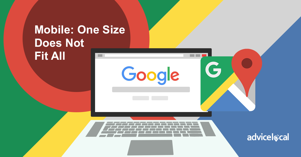
Now that most browsing occurs on the small screen, there is no doubt that mobile optimization is crucial for a business’s success. Google has even introduced several algorithm updates that penalize non-mobile-friendly websites in mobile search results. Google’s creation of the AMP project in 2015 resulted in AMPed sites being marked accordingly in mobile search results, and will appear above the others. Plus, social networking sites are integrating features to provide a better user experience for the mobile consumer. (Yes, I’m referring to Facebook Instant Articles.)
We’ve all been talking a great deal about the importance of mobile-friendly website optimization for years, yet countless businesses still fail to provide a mobile experience for their customers.
None of this has slowed us down from taking a mobile-first approach, with websites and content created purely for the small screen. In fact, some go as far as to claim that the desktop is all but irrelevant, and that mobile-only is the only approach worth taking.
So what’s the best answer? Provide your ideal customer with what they want and need, when they want it! This includes creating a mobile experience that integrates a click-to-call button, the ability to schedule an appointment online, even to reserve a dressing room, down to a navigation that works well on the desktop and mobile (no matter the screen size). Depending on the type of business, this could even mean having a mobile app where customers can access the menu, place an order, or find the business location closest to them.
Size Does Matter: Designing Consumer-First
I believe and evangelize that mobile is the new local, and recommend an approach that accomodates all users regardless of the device they browse from, or where they happen to be sitting when they run the search. Keep in mind the multitude of different devices for browsing, ranging from smart televisions to smartphones, to the traditional desktop computer. We must strive to create a user-centric experience for all consumers.
Traditionally, websites have been designed on the big screen, which seems natural since this is where the development work also takes place. This type of workflow involves initially designing a website for the big screen before scaling it down to the small one, deleting clutter and incompatible features along the way to create a better mobile experience. This process, often referred to as graceful degradation, usually results in a nice-looking desktop website that offers a sub-par small screen experience.
Today, many designers and web developers are flipping the workflow around to follow the progressive enhancement model. Progressive enhancement actually begins with the small screen, gradually adding features and functions rather than taking them away.
As you review these points, think of it this way: do you only want customers who are using a mobile phone to find out about your business? Of course not! It is quite simple – you just want the customer!
In one sense, how they find you and what device they use to do so is irrelevent. But because these factors can be identified and measured, they do matter without a doubt. An increased understanding of the nature of mobile, local search, and the user experience will help you direct your business to build user-centric design. This is a win for both the consumer and the business.
Are you ready to provide your ideal customer with what they want and need, when they want it?
Be sure to come back next week as I continue this journey into mobile and local.