

 214-310-1356

In our mobile-driven economy, the importance of maintaining a consistent, up-to-date mobile presence cannot be overstated. After all, 82% of consumers use their smartphones to access product reviews and other decision-driving data when making in-store purchases.
A business can make its mobile website even more consumer-friendly with faster load times, simpler site navigation, and designs that cater to smartphone users. Incorporating web design principles that contribute to a smoother user experience allows a business continue to gain visibility in search results (because Google loves mobile-friendly web content) and drive conversions among mobile consumers.
Four Emerging Mobile Design Trends Plus a Powerful Bonus
1. A Rise in Bold Typography
Gone are the days when every website was expected to use a simple, conservative font for headings and a standard serif font for body copy. We’re seeing a resurgence of custom typography that boasts originality and character. Using a unique font on a business’s website allows the text to fully become an extension of the brand – not just in what is said by the copy, but in what it looks like.
Brands need to get a bit more creative in their choice of font this year. Particularly when designing large headers that will dominate a mobile screen or creating buttons that need to grab a user’s attention.
2. Original Visuals Replacing Stock Images
Most likely this isn’t new information for you, but stock images are out. Along with that, the use of stock images is a missed branding opportunity. Standard stock images are not memorable or powerful, and often leave website visitors feeling underwhelmed. More businesses are realizing the potential of visuals to contribute to a cohesive brand identity. This realization has resulted in consumers preferences changing and they definitely notice when a business is not original.
Another important point to consider is whether the business opts to display professional photographs, user-generated content curated from social media, or fun animations. It’s important to ensure the image files are optimized to load quickly and display properly on every device and browser.
3. Breaking the Traditional Grid Layout
Many web designers are moving away from the typical grid format in favor of something more flexible. Part of the reason is the popularity of responsive design; smartphone screens are a different shape than computer screens, so it no longer makes sense for website layouts to adhere to the rule of thirds.
Breaking out of the confines of the grid gives business owners the power to get more creative in their design choices. For instance, a non-traditional menu animation can be used to make a website more feel more tactile and life-like to mobile visitors who tap on it. Businesses should prioritize the user experience on a mobile screen over traditional desktop screens, which often means scrapping the grid in favor of a more modern layout and interactions.
4. Micro-Interactions Matter More than Ever
Consumers are accustomed to having everything they could possibly want available at their fingertips when they want it. Whether they’re Googling an obscure fact, looking for the nearest coffee shop, booking an appointment online, these brief interactions are known as micro-moments – and they’ve become an integral part of the modern consumer experience.
Businesses need to consider how customers will interact with their website on mobile devices. Making sure the most important information on a company’s website is easy to find and access on any device is crucial to reducing bounce rate, increasing conversions, and improving mobile consumers’ experience.
5. Consider a Branded Mobile App
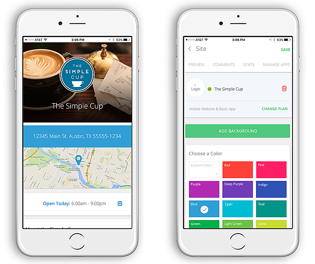 Here’s that bonus I promised. I know we’re talking mobile websites, but I’d be doing a disservice if I didn’t address mobile apps.
You can create the best website in the world, but the fact is there are unbelievable benefits to having a branded mobile app, too:
- Consumers can access the app with a simple click.
- The ability to send push notification to users highlighting special offers.
- Feature products, menus and much more in an easy-to-view format.
(BTW… We have a mobile app solution, Advice Mobile. No coding. No frustration. Powerful and simple. Click now to learn more.)
Want to learn more about building a stronger mobile presence? Check out our free mobile e-book for tips on connecting with mobile consumers.

Be sure to come back for more mobile marketing and local search tips from the #QueenofLocalSEO next week.
It is a must to be updated and walk with the trends for all businesses having online presence. In the era of handheld devices one has to match with client expectations and beyond that to stay ahead in the competition. Bernadette I appreciate your efforts to provide this descriptive information for us. This post covers all the important factors which are must need for the mobile app design in 2017. Thanks for sharing this mate.
Anit, thanks for you comment! Mobile is definitely not going away, so staying up on these trends is a must!